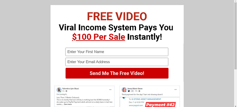
Your HercuList PLUS optin form should emphasize the big benefit of your lead magnet, so your website visitors subscribe to your email newsletters in exchange for receiving it.
An opt-in form that converts must have the following components:
- Lead magnet headline: Make sure your headline clearly describes the lead magnet’s main benefit.
- Is your description brief, clear, and to the point? It is easy to scan what a reader will receive if you use bullet points.
- Include a visual representation of the lead magnet, like a mockup of your e-Book, etc.. Adding a photo of a person looking at the optin form can also increase conversions.
- Keep the form simple: Only ask for your first name and email address. Your conversion rate will suffer if you ask for too much information too soon.
- You should use a contrasting color for your subscribe button, so that it stands out on the page. Use non-generic email copy that gets people clicking right away (“Send Me The Free Video!”)

After creating your optin form, you’ll need to install it on your site. Here are 14 places where your opt-in form will convert well:
- The splash page
- The welcome gate
- A floating bar
- Header of your website
- Archive page for the blog
- In your blog posts
- In your sidebar
- A timed lightbox popup
- Scrolling box
- The footer of your website
- The About page
- Pages with resources
- On a dedicated sign-up page
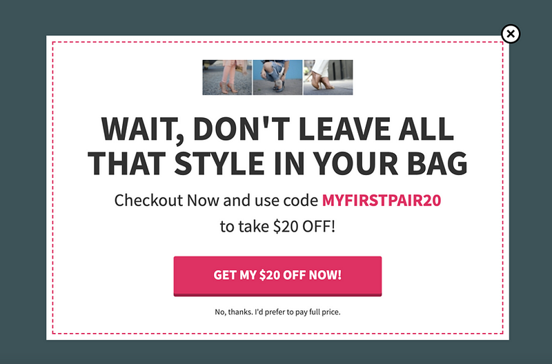
- Exit-intent pop-ups
Now For a Quick Word About Exit-intent Pop-Ups

It’s a last-minute pitch: Wait! Don’t go! Sign up and join before you leave!
When you attempt to leave a website, it often appears as a sign-up form that pops up in a new window. Those of you who have encountered the exit-intent pop up already know how annoying it is. You should not use this tactic if you are trying to build your own email list. Here are some alternatives:
Exit-intent Popups = Bad Last Impression
Marketers love pop-ups, consumers hate them, but when used properly, they convert incredibly well.
However, Exit-intent pop-ups that prevent visitors from leaving your page leave a bad impression.
Imagine browsing a website and deciding that a product just isn’t for you. The “back” button on your browser is clicked — STOP!!! Are you positive you want to exit our site without at least signing up for our newsletter?
Yes, I am absolutely certain. Why would I want your stinking newsletter if I’m not interested in your product? Please let me check my Facebook now.
This is the problem with exit pop-ups. Those who leave your site have already made up their minds — either they bought something from you and decided they wanted your emails, or they decided they didn’t. Pop-ups asking them to reconsider won’t change their minds.
People who sign up through a pop up form tend to be less engaged with your emails even if they do give in and give their email address.
Isn’t it true that popups are ineffective?
When used correctly, they can be very effective. Inc observed that consumers didn’t mind pop-ups in the right context even back in 2004.
A number of marketers have seen explosive list growth by using pop ups on their websites. To test a popup form, follow these steps:
- Delay is a good idea. Popups shouldn’t be displayed immediately. Take the time to let people familiarize themselves with your site. As they become familiar with your content, they will be less bothered by popups.
- Be careful with your wording. It’s important to know the difference between inviting and badgering. Make sure not to harass people with a hard sell for your newsletter. Take a gentler approach to explaining the benefits and test your wording to see what resonates with people.
- Be nice, don’t be annoying. Growing your list doesn’t require a pop-up on every page. It’s not even necessary to display your pop-up every time someone visits your site.
What are your thoughts on pop-ups? Have you made any pop-up mistakes — such as the exit form maybe? Please feel free to share your story in the comments. Thank YOU!!!
To Your Marketing Success!
George Balek 😀

